


Thursday, September 30, 2010
Monday, September 27, 2010
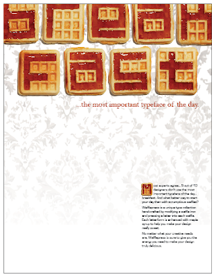
Wafflepress Ad
My final Ad for Wafflepress. The imagery behind "breakfast" is meant to evoke the feelings and sentiment of one's favorite breakfast spot. Initially, I thought something more along the lines of
Waffle House, but I decided that I wanted to show that the type could have a more special, quaint feeling. (Everyone has their special little breakfast place that's better than your special little breakfast place.) The image is also meant to highlight the typeface and make it pop out, not to draw attention away from it. Also, I wanted the food to be eaten, not beautifully presented and untouched. I wanted you to feel satisfied after having eaten a hearty breakfast. Maybe you're still sitting around the table, enjoying the atmosphere, sipping your coffee, and talking about all the great design you're going to do today.

Waffle House, but I decided that I wanted to show that the type could have a more special, quaint feeling. (Everyone has their special little breakfast place that's better than your special little breakfast place.) The image is also meant to highlight the typeface and make it pop out, not to draw attention away from it. Also, I wanted the food to be eaten, not beautifully presented and untouched. I wanted you to feel satisfied after having eaten a hearty breakfast. Maybe you're still sitting around the table, enjoying the atmosphere, sipping your coffee, and talking about all the great design you're going to do today.
Friday, September 24, 2010
A Block of Type (Week 5)

With one exception, these examples of typography were found in and around the block of Peachtree Street between 3rd and 4th in Midtown Atlanta. (STEEL is located on W. Peachtree near 10th.)


Thursday, September 23, 2010
Inspirations and Aspirations (Week 4)
 |
| Herbert Matter. The first time I saw his work, I was blown away by how fresh, almost timeless, it looks. Some of his work looks as if it was created a few years ago. He revolutionized design concepts. |

 |
Clifford Bailey: A California artist working with oils, who does incredible paintings/illustrations of musicians. I love how he captures the mood, energy, and sophistication of the characters. |

Previously posted Sept 20, 2010
Wafflepress Advertisement Progress
Here is what I have thus far. I have planned a photo shoot of breakfast foods for later this week. The idea with the copy is to borrow some of the terms/ideas associated with breakfast and apply them to design, hence: "Breakfast...the most important typeface of the day."

Perceived Design Trends (Week 3)
Large slab serif type, as well as type used as the primary focus of a design. Slabs are often used for short phrases meant to grab our attention. These are not always the most beautiful to look at. To me, they can be heavy and slow, but in moderation they can be used effectively.


Hand-drawn images and type. These are great because they often stand out better and can draw our attention better than a photograph. People will always be impressed by a great drawing. And hand written type can feel more personal.

One page web layout, as well as websites that are inspired by print or magazines. These websites can be difficult to look at. Much like magazine covers or content pages, every bit of information is crammed onto one page in fear that you will never find it elsewhere. It is a challenge for designers to make these pages look good with so much information.

(Previously posted Sept 12, 2010)
Type Project: Wafflebet


Here is my first attempt at my Waffle Iron Type. It has actually worked out better that I could have imagined. I used Sculpey (the white things) to fill in and connect the gaps in the waffle squares. I had initial concerns about the Sculpey burning, or sticking to the waffle batter, or worse yet, sticking to the waffle iron and rendering it useless. None of that happened. In fact the Sculpey hardened (as it does) and was easily removable from the iron. Not only was it removable, but I am able to reposition the pieces (sort of like a letter press) to make new letterforms. As it turns out, the syrup is needed to create enough contrast in the letterforms (see last photo). I have at least 18 more letters to make and then photograph, but hey, it makes the house smell good.
(Previously posted Sept 9, 2010)
Cool Type Examples
iQ font - When driving becomes writing / Full making of from wireless on Vimeo.

Furniture Type.
(Previously posted Sept 7, 2010)
Invites for Fox Theatre Events
Here is an invitation to an event celebrating the completion of a restoration project for the RITZ Theatre in Brunswick, GA. The logo is based on the decorative elements above the windows of the theatre. The sign illustration is meant to grab attention for citizens of Brunswick who will immediately recognize the most distinctive part of the building.

Here is an invitation for the fall meeting of Georgia Presenters (A Program of the Fox Theatre). GA Presenters is a state-wide booking consortium for theatres to help each other bring great talent to their stages. The theme is the ubiquitous theatre poster box for displaying upcoming shows. The image is meant to get theatre owners/operators/bookers excited about building a great program for their theatre.
I believe the Georgia Presenters logo was designed by Clarissa Brandao.

Subscribe to:
Posts (Atom)