

Wednesday, December 15, 2010

Music Department Website
Here is a link to the final project for Multimedia Design, a music education website for kids.
www.noodlenoise.com/thearts/MusicDept

www.noodlenoise.com/thearts/MusicDept
Wednesday, December 8, 2010
Haiku Poem (week 15)
This poem was inspired by the wonder and innocents of a very creative three-year-old.


Monday, December 6, 2010
Artwork I Have Collected (week 14)
 |
| William K. Stidham - "Willie" from The Sacred Heart Series |
 |
| Thomas Arvid - "With Pride" |
 |
| Thomas Arvid - "Slice of Napa" |
 |
| Traditional art from Senegal |
 |
| Morgan Victoria. I bought this from a girl that worked at Starbucks. |
 |
| Screen print made by Seattle Show Posters. |
 |
| Jonathan Hart - "The Recital" Painted in 2004. I had to include one of my own! |
 |
| Leonard Filgate - "Ripsqueak" Illustrator for children's books. |
Sunday, December 5, 2010
Great Album Covers (week 13)


 |
| Um...duh! |


 |
| King Crimson - In the Court of King Crimson |
 |
| Doors - Strange Days |
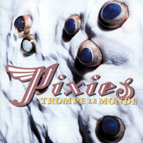
 |
| Talking Heads. Designed by David Byrne. Made from polaroids. |
Monday, November 29, 2010
2012 Calendar Progress
This past Thanksgiving break was a week of immense frustration with the calendar project. My initial idea was to make a "Commonly Misspelled Words Calendar" with a different word for each day. I worked on that idea for about six hours knowing within the first hour that it wasn't working. It looked like a jumbled mess on the page. It was visually bland. I tried different fonts, alternating colors, different sizes, column widths, alignments, you name it... Needless to say, I walked away defeated. I even said to myself, the Panthers at least scored 7 against Alabama, but I have nothing.
The next day, I reevaluated just what it was that I wanted to accomplish with this calendar. I simply wanted to design a calendar that would exhibit the beauty of type. It didn't need a gimmick. With that renewed vision, I got to work.
The idea became to allow the days and weeks of each month to determine the placement of each letter of type and then to number each letter accordingly. The result shows the uniqueness' and aesthetic qualities of various typefaces. One of the beautiful surprises was the resultant negative space and counters of each letterform. It not only draws your attention to the letterform itself, but to the space around it as well. The typefaces for each month were chosen based on two criteria: 1. I liked it/used it often, 2. It had a bold. Color became an important factor. Each month's colors are intended to capture the feeling of the month or that time of year: cold colors, warm colors, spring colors, fall colors, etc. The days of the week are included at the bottom for 2 reasons: to show off the type in lowercase form and to let the viewer know that the days and weeks are laid out in order even if they don't line up like a traditional calendar.
Here are a couple of examples:

The next day, I reevaluated just what it was that I wanted to accomplish with this calendar. I simply wanted to design a calendar that would exhibit the beauty of type. It didn't need a gimmick. With that renewed vision, I got to work.
The idea became to allow the days and weeks of each month to determine the placement of each letter of type and then to number each letter accordingly. The result shows the uniqueness' and aesthetic qualities of various typefaces. One of the beautiful surprises was the resultant negative space and counters of each letterform. It not only draws your attention to the letterform itself, but to the space around it as well. The typefaces for each month were chosen based on two criteria: 1. I liked it/used it often, 2. It had a bold. Color became an important factor. Each month's colors are intended to capture the feeling of the month or that time of year: cold colors, warm colors, spring colors, fall colors, etc. The days of the week are included at the bottom for 2 reasons: to show off the type in lowercase form and to let the viewer know that the days and weeks are laid out in order even if they don't line up like a traditional calendar.
Here are a couple of examples:


Monday, November 22, 2010
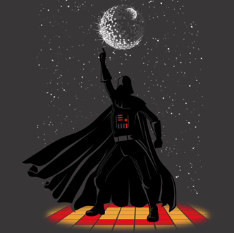
Cool T-shirts (week 11)
 |
| Saw some of the shirts from Paste T-Shirts at the Indie Craft Experience. |
 |
| Really cool t-shirt designs at Threadless. |
 |
| This guitar shirt is cool. From Uneetee. They have a new design every monday. |
Subscribe to:
Posts (Atom)