
Tuesday, December 6, 2011
Stop Bullying PSA
When Will It End? - Stop Bullying PSA from ziegelhouse on Vimeo.
Filmed in Marietta, GA, December 1-2, 2011. School scenes filmed at Wheeler High School. Thanks to Lynn Berry. Camera assistance by Eric Krezel.
Edited in Final Cut Pro. Effects and type animations in After Effects.
Music: On Your Side by Pete Yorn
Thanks to Andy Berry and Kellee Hart.

Monday, December 5, 2011
Stop Bullying Poster
The theme of my campaign is places, almost like memories, where young people are bullied. In this poster, it is a place that may conjure up feelings of inadequacy and being ridiculed. The hope is that victims of bullying will relate to these feelings, understand that they are not alone, and ultimately seek help. Others may view it sympathetically and respond by taking action.


Poor Man's Film Dolly
Here's a pic I snapped of my makeshift "film dolly." It consists of a camera tripod mounted onto a jogger stroller. The great thing about the jogger stroller is the large, inflatable tires that allowed it to roll quite smoothly.
As you can see in the video above, I wanted shots of slow movement in each scene. It was important that the camera was moving, as opposed to a stationary camera zooming in or out, so that it would create a sense of dimensionality and depth. It worked splendidly.
Watch out Ron Howard!
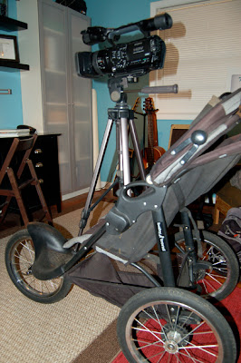
As you can see in the video above, I wanted shots of slow movement in each scene. It was important that the camera was moving, as opposed to a stationary camera zooming in or out, so that it would create a sense of dimensionality and depth. It worked splendidly.
Watch out Ron Howard!

Sunday, November 27, 2011
5 Projects
2. WhipStitch Promotional Brochure. This project pertained to a subject, sewing, that challenged me to create a layout that was feminine, modern and beautiful. The goal was to show sewing as a lifestyle, not just a hobby. I wanted people to feel that WhipStitch was far more than a sewing/fabric supply shop, but a place that supported sewing as that lifestyle.
3. WafflePress - Illustrative Type. This was an incredibly fun project to work on. The biggest challenge with this project was to develop a concept that was fresh and original, in other words, that had not been done before. The type had to be clear and legible. The waffles possessed a grid which allowed the letter forms to look consistent and proportionate.
4. Kroger Package Design. By far the greatest challenge with this project was to design 3 seperate, individual, unique packages that somehow felt unified under the Kroger brand umbrella. I wanted each to have distinguishable features so that it felt like 3 separate brands, and yet they would be easily recognizable as a part of the new Kroger Identity.
5. Vineyard Wine Market - Identity. VWM was in need of a new, more refined, sophisticated look, one that was representative of their market position, that is a small boutique wine/gift shop that offered the time-honored tradition of fine wines, yet in an approachable, unpretentious manner. The challenge was to create an identity that captured the feeling that it is worth driving past the grocery store to purchase wines.


Wednesday, November 16, 2011


Sunday, November 13, 2011
Kroger - Naturally Preferred - Package Design
It made a lot of sense to allow the natural, unbleached cardboard material to be a prominent feature of the design in keeping with the organic, untampered-with sentiment of the pasta. I used the shape of the penne to create a playful pattern. This design element would work across multiple pasta types such as long, thin lines for spaghetti, or curved "c" shapes for elbow macaroni. The goal was a clean simple design with an elegant, earthy, sophisticated feel. I want consumers to feel that even an inexpensive store brand could satisfy the "wants" of their lifestyle.


Wednesday, November 9, 2011


Subscribe to:
Posts (Atom)